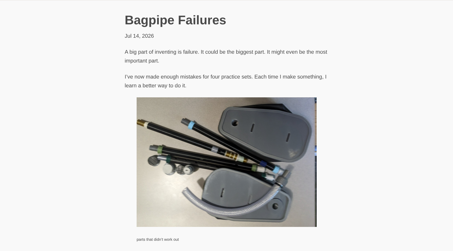
Woozle.org has always had a minimalist aesthetic. For a while this made it look dated; a few years later it looked forward-thinking; now it looks modern. In a few years it will look dated again. The important thing is that it renders well on different screen sizes, and doesn’t distract from the content.
Yesterday, I found a style sheet that I liked better than mine,
so now the site looks a little different.
This new style feels more focused on the words,
eliminating the needless background image.
It’s also allowed me to vastly reduce reliance on class attributes.
The old site The new site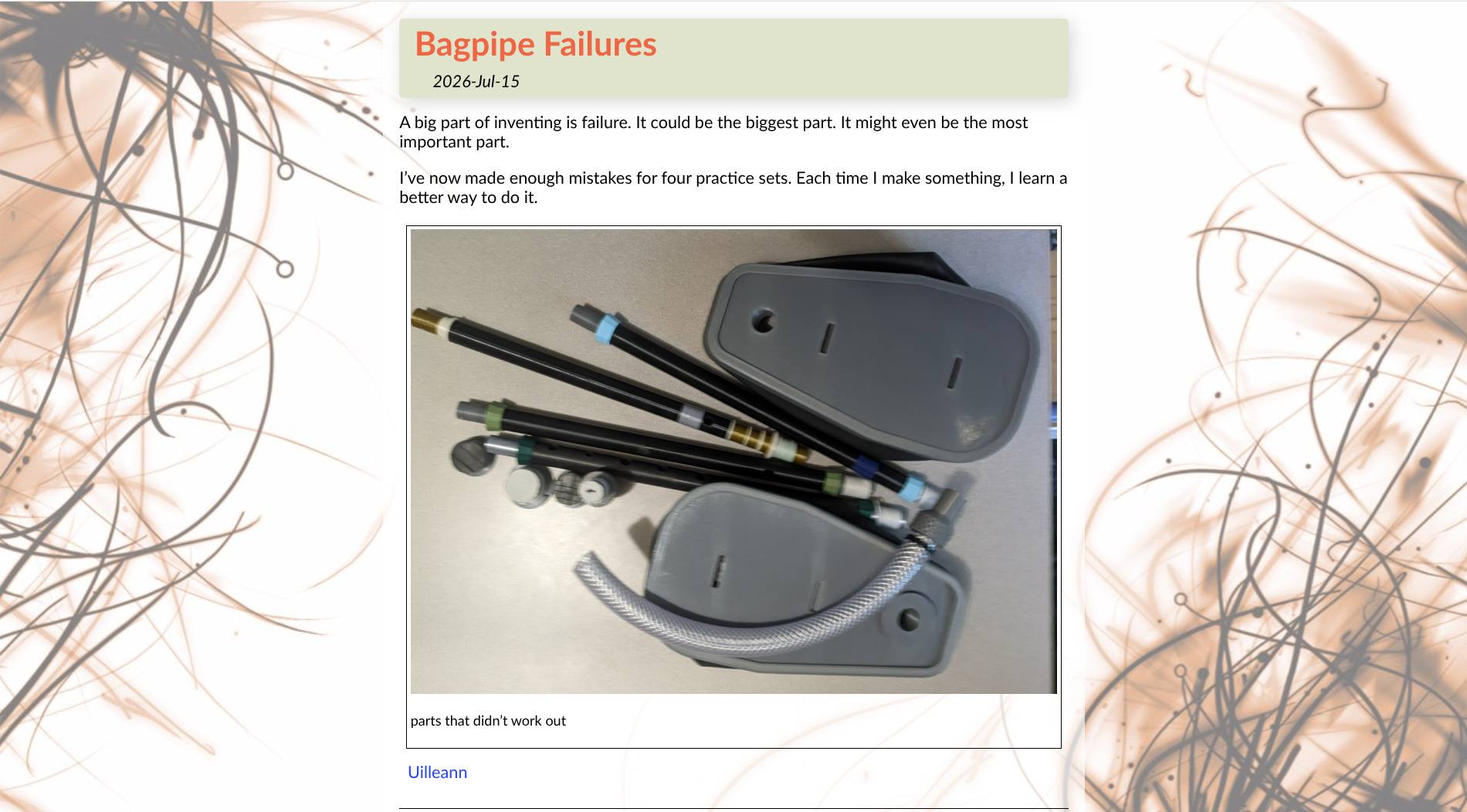
There are no “breadcrumbs” here, so you’re going to have to use the back button in your browser. Older browsers had an “up” button: that will work too, if you have one. You can edit the URL, too: it’s still quite prominent in every browser. I figure most people are only here for a single page anyway, and they don’t care about the rest of the site.